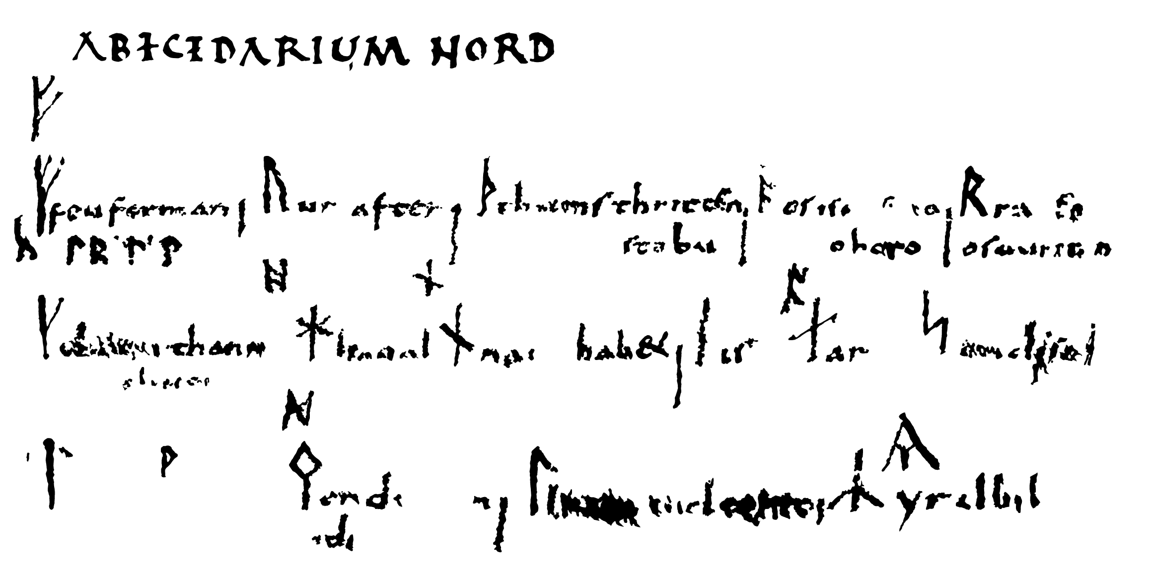
Abecedarium Nord[manniscum]
The 9th-century Codex Sangallensis 878 consists mainly of excerpts of several grammatical texts. Among this material there is a page and a half containing four writing systems: a Hebrew abjad, a Greek alphabet, an Anglo-Saxon fuþorc and a Younger fuþark; all originally neatly written and consciously laid out. Secondary content now clutters the different parts to varying degrees, but this is possible to tell apart. Some content has been rubbed away due to this leaf at one time having been bound as the last. What has been lost are partially trivialities that can be interpolated with certainty, but items of crucial importance are also afflicted – including the names of some of the younger fuþark runes. The major damage, however, is the result of the librarian at St. Gallen, Ildefons von Arx, in the 1820s applying reagents to the parchment in the hope of making the faint parts for a short moment more legible. He reported what he could then see in the form of a drawing, but the process left the page with irrepairable damage in the form of severe staining.
Good photographs of the manuscript are available, but due to the damage and the unique and interesting contents, this leaf is a prime candidate for multispectral imaging.
Facsimile
In the transcription below, approximations of the Latin letter variants are given, whereas non-latin characters in contrast are given in normalised form. Secondary additions are omitted, and conjectural replacements for lost content is given in red. At some points, I depart from previously published readings; these are discussed in the following sections.
|
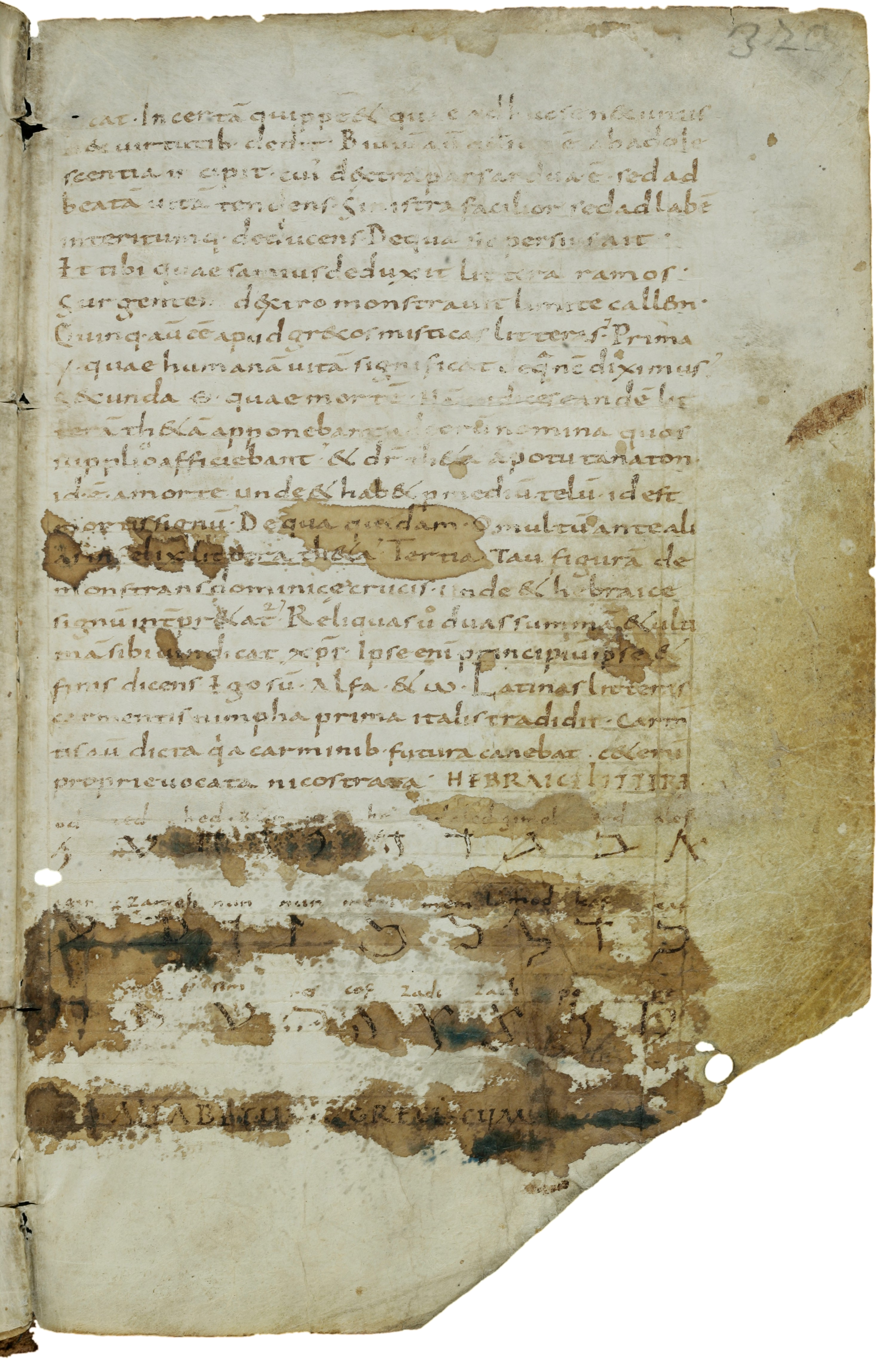
fıcaꞇ·Incerꞇa̅ quıppe Ɛꞇ quae adhuc ſe nƐc uıꞇııſ nƐc uırꞇuꞇıb·dedıꞇ·Bıuıu̅ au̅ qđ ſuꝑ·e̅·ab adole ſcenꞇıa ıncıpıꞇ·cuı̕ dƐxꞇra parſ ardua·e̅·ſed ad beaꞇa̅ uıꞇa̅ ꞇendenſ·Sınıſꞇra facılıor ſed ad labe̅ ınꞇerıꞇumq·deducenſ·Dequa ſıc perſıuſ aıꞇ· Eꞇ ꞇıbı quae ſamıuſ deduxıꞇ lıꞇꞇera ramoſ· Surgenꞇem dƐxꞇro·monſꞇrauıꞇ lımıꞇe callƐm· Quınq·au̅ ee̅ apud grƐcoſ mıſꞇıcaſ lıꞇꞇeraſ·̕Prıma ·Υ·quae humana̅ uıꞇa̅ ſıgnıfıcaꞇ de q̂ nc̅ dıxımuſ·̕ Secunda·Θ·quae morꞇe̅·Na̅ ıudıceſ eande̅ lıꞇ ꞇera̅ ꞇhƐꞇa̅ apponebanꞇ ad eoru̅ nomına quoſ ſupplı·cıo affıcıebanꞇ·̕Ɛꞇ dr̅ ꞇhƐꞇa apoꞇu ꞇanaꞇon ıd·e̅·a morꞇe unde Ɛꞇ habƐꞇ ꝑ medıu̅ ꞇelu̅·ıd eſꞇ morꞇıſ ſıgnu̅·̕De qua quıdam·O mulꞇu̅ anꞇe alı aſ ınfelıx lıꞇꞇera ꞇhƐꞇa·̕Terꞇıa Tau fıgura̅ de monſꞇranſ domınıcę crucıſ·unde Ɛꞇ hebraıce ſıgnu̅ ınꞇ̅prƐꞇaꞇᷣ·̕Relıquaſ uͦ duaſ ſumma̅ Ɛꞇ ulꞇı ma̅ ſıbı uındıcaꞇ xp̅r·Ipſe enı̅ prıncıpıu̅ ıpſe Ɛꞇ fınıſ dıcenſ·Ego ſu̅·alfa·Ɛꞇ ω·Laꞇınaſ lıꞇꞇeraſ carmenꞇıſ nımpha prıma ıꞇalıſ ꞇradıdıꞇ·Carm̅ ꞇıſ au̅ dıcꞇa qͥa carmınıb·fuꞇura canebaꞇ·cƐꞇeru̅ proprıe uocaꞇa nıcoſꞇraꞇa· hebraice littere
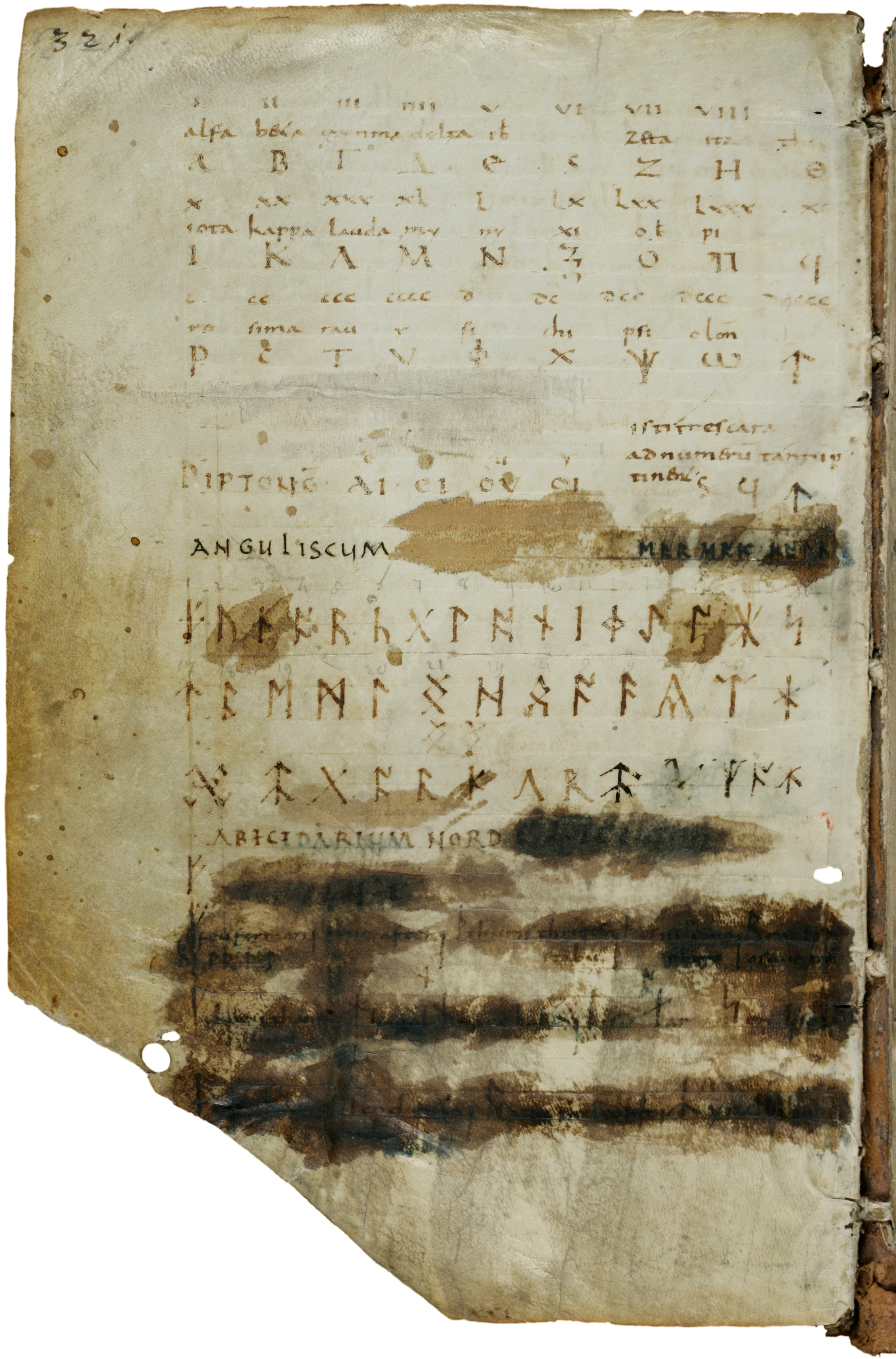
alfabetum greciscum |
anguliscum
abecedarium nordmanniscum
|
The Latin text shown in grey here is an excerpt of De Grammatica, the first section of Book 1 of Isidore’s Etymologiae. The contents are not discussed here, but provide illustrative examples of the conventions and idiosyncrasies of the scribe. Apart from headings in rustic capitals, the letters are standard Carolingian; using tall e consistently before t and x, often before c, m and n, and sporadically before r. With few exceptions this e and the following letter form ligatures, but for clarity these are dissolved to their underlying letter-forms here. The ligating form of t is similar to an x without the lower left arm, and the resulting et-ligature is the source of and very similar to the modern ampersand character. Insular d (d rotunda) occurs sporadically, though not in this excerpt.
It seems that the scribe had an aversion against digraphs, both where unnecessary and where signifying important distinctions. Except initially (no examples on this page) and sporadically in final position, ae is written e, or occasionally ę. The headings have alfabetum and diptong̅ where ph would be expected. The names of the Greek letters include alfa and fi, but in contrast to these theta and chi (the former of each pair in the Latin text as well as in the Greek alphabet). The text quotes a Greek phrase, ἀπὸ τοῦ θανάτου, “from the death” in Latin transliteration. It is rendered as apotu tanaton, disregarding the distinction between τ and θ (and apparently with a misreading of final -ου as -ον).
Hebrew letters
Immediately following this text is the heading hebraice littere for hebraicae litterae, Hebrew letters. Using e for ae is consistent with the custom in the Latin text above. This introduces a Hebrew abjad laid out over three lines. The letters are ordered from right to left, which suggests that the author knew how Hebrew is actually written, and was not just slavishly copying a list. Above each letter its name is written; as no sound values are given, it must be assumed that these were considered to be the same as the initial letter of each name. In difference to the Greek alphabet on the following page, numerical values for the letters are not given. The five variant letter-forms used in word-final position and sometimes used as numerals are included, but are placed following the normal form of the same letter, and not at the end as they would be if the letters were organised by numerical value. They are given the same names as the corresponding normal letter-forms with no indication that they are final forms. The space at the end of the third line is later filled with a secondary addition. As this consists of a less corrupted version of the preceding letter, it is presumably meant as a correction to this.
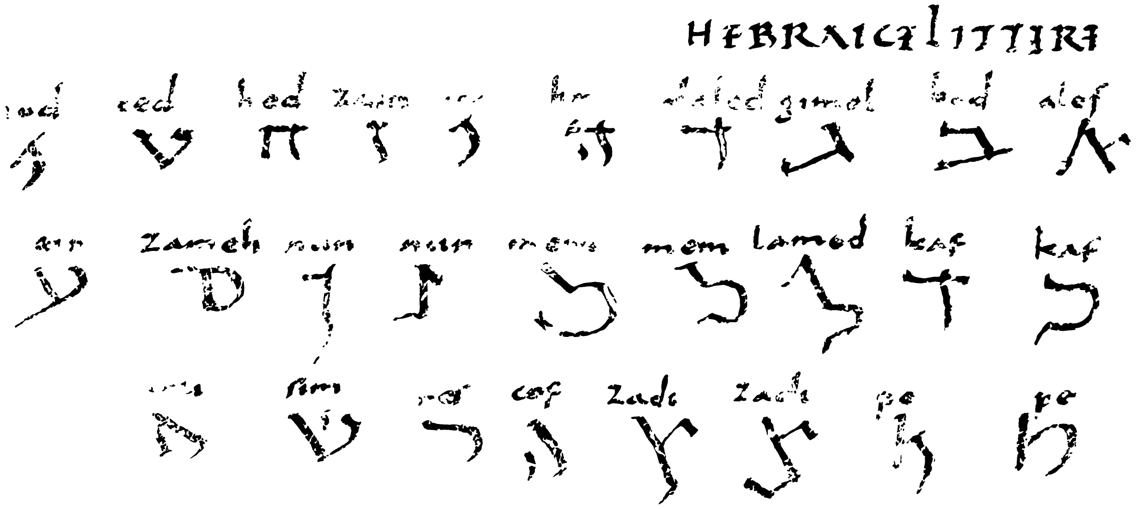
The letter names are uniquely transformed in order to avoid the use of digraphs. Many of the resulting simplifications can be found in the rendering of the names in other European manuscripts, but several distinctions that are normally preserved are lost in this set of names. A comparison with an idealised list with more original versions of the name variants that must be assumed to form the source of the preserved list highlights this:
| SG 878 | alef | bed | gimel | daled | he | [uau] | zain | hed | ted | iod | kaf |
|---|---|---|---|---|---|---|---|---|---|---|---|
| Source? | aleph | beth | gimel | daleth | he | uau | zain | cheth | theth | iod | kaph |
| SG 878 | lamed | mem | nun | zameh | ain | pe | zade | cof | res | sim | [ta]u |
| Source? | lamed | mem | nun | samech | ain | pe | tsade | qoph | resh | shin | tau |
The sibilants in particular suffer under the Latin alphabet’s smaller range of this class of letters. Shin is turned into sim (the final sound possibly under the influence of Greek sigma, spelled sima in the Greek alphabet on the following page). The change to s here might be the motivation behind the change of samech to zameh, even though this conflated its initial sound with that of zain instead. When in addition tsade became zade, three letters ended up with the same initial letter, and hence sound value. While ch is reduced to h in all positions (conflating the initial sounds of he and cheth); th becomes t initially (removing the contrast between the onsets of theth and tau), but d in final position. The latter does not have any consequence for the sound values, but while the codas of beth, daleth, cheth and theth normally contrast with that of lamed, they are conflated with it in this manuscript. Iod is a special case, as this often conforms to the former pattern rather than the latter in European manuscripts, most likely by dittography as it follows two such names. Some form of distinction between kaph and qoph is retained, written with k and c respectively, but it is not possible to be certain if this reflects the source manuscript or is part of the same reworking.
Greek letters
Below the Hebrew letters is the heading to the Greek alphabet on the
following page. Derolez presents this as alfabetum
grecum cum numero
without further comment. However, this is a highly
conjectural reading, probably arrived at with the heading of the Greek
alphabet in Cotton MS. Domitian A 9 in mind. This is even less visible;
he reads it as litterae grecae cum numero (?)
, in the high
resolution images now available from the British Library, I read it as
Litteris grecis cum nume ro
, where the last space
is due to the descender of a letter on the previous line, and the second
e presumably was originally ę.
In Codex Sangallensis, though, there is no trace at all of the word
numero, and unlike on the following page (once bound as
the last), there is no evidence of whole words being rubbed away on this
page. Further, Derolez’ reading means that the right-hand half must be
understood as grecu̅ cum
, whereas it is fairly clear
that the only possible reading is the non-standard form greciscum
.

Adjectives in -iscus (neuter -iscum) appear in late and mediaeval Latin. As the suffix stem from a conflation of Greek -ισκος (-iskos) and descendants of Proto-Germanic *-iskaz, this is a sign of strong influence from a Germanic language. It is interesting to note that the corresponding Anglo-Saxon adjective is grecisc, with the dative plural greciscum.
Like the Hebrew letters, the Greek alphabet is laid out on three
lines of letters with names above each, and without explicit sound
values. Here, however, here the numerical value is given in Roman
numerals above the names again. The three archaic letters used only as
numerals are included in the position corresponding to their numeral
value; the spaces where their names would have been are left blank.
Below the alphabet these are explicitly described by the text ıſꞇı ꞇreſ cara |aꝺ numƐru̅ ꞇanꞇu̅ ꝑ|ꞇınƐnꞇ
<stigma> <qoppa> <sampi>
(the final t
is a
ligating form). Supplying the letters cteres
in the gap yields
the text isti tres cara[cteres] ad numerum tantum
pertinent ϛ ϟ ϡ
– these three characters only pertain to
numbers: ϛ ϟ ϡ
. To the left of this explanation is the heading Diptong̅ followed by the digraphs αι ει ου
οι, and above these the sound values e
, i
, u
and y
.

The letter y
is used as the name of upsilon, as the
vowel in the letter-names mu and nu and as the sound value
of the diphtong οι. In contrast, the Greek alphabet in Cotton MS.
Domitian A 9, the value of upsilon is given as ei. This
use of y
as a Latin letter with a distinct and unique sound value
is alone suggestive of an author whose native language and original
scribal training was Anglo-Saxon. This is supported by the form
greciscum in the heading, even though other Germanic languages
would also fit this. Also the extreme tendency to avoid digraphs is most
easily understood if the author had his scribal background in the
Anglo-Saxon tradition, as its orthography in this period stood out as
the one with the cleanest one-to-one mapping between phonemes and
letters, often written entirely without digraphs.
Anglo-Saxon runes
The next section is introduced by the heading anguliscum; it does not seem as if anything has been
rubbed away following this word. From the context this obviously
represents the adjective English
, with the neuter noun
alphabetum
from the preceding heading implied. Stowe MS 57 writes
Anglıcę lıꞇꞇ̃ę
, representing the expected anglicae
litterae
for the additional letters used for writing
Anglo-Saxon with Latin letters; the Orrmulum has alphabeꞇum
anglıcum
. Like greciscum in the previous heading, the form
used here is unique to this manuscript, and is formed in the exact same
way, parallelling Anglo-Saxon Englisc/Ænglisc, dative plural
Engliscum/Ængliscum. The first u
, is not fully explained
by this, though. It could represent the pronunciation in the scribe’s
own dialect, it could be an attempt at etymological speculation or
possibly even a kind of pun where the term represents both
English
and angular
at the same time, referencing the
visual appearance of the runes in contrast to the Latin alphabet. The
letters in the heading are re-traced in a darker (or at least less
faded) ink; but as a narrower pen is used, it is fairly certain that
this follows the original strokes faithfully.
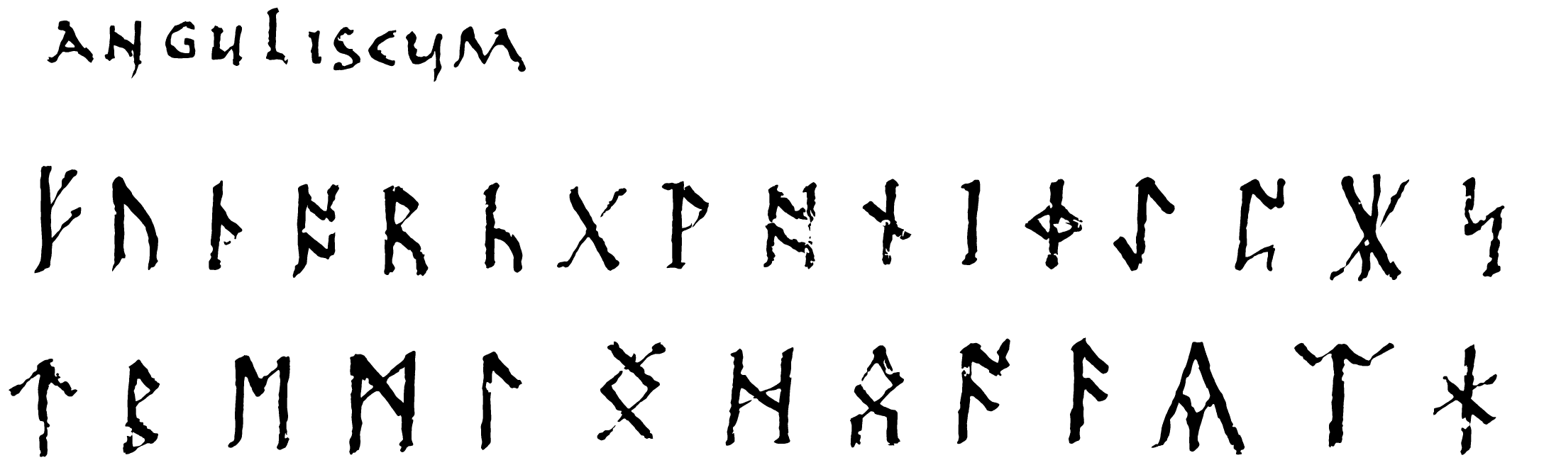
The primary content is a neatly written and rather uncorrupted 29-rune Anglo-Saxon fuþorc, consciously laid out over two lines with the line break separating the second and third ætt, and the second line spaced out so that its thirteen runes takes up the same width as the sixteen of the first line. This strongly suggests that the inclusion of rune 29 was intended from the outset by the original scribe, despite in reality being a superfluous duplicate of rune 12.
Surprisingly, given the context, neither names nor sound values are given. In light of the several indicators of the Anglo-Saxon background of the author already mentioned, the most reasonable explanation is that these were as trivial to him as those of the Latin alphabet, and did not warrant inclusion. This is also the most natural explanation why, as will be discussed below, the younger fuþark runes in the following section are left unexplained if identical to the corresponding Anglo-Saxon rune, but glossed by its Anglo-Saxon counterpart if different to that in shape.
As manuscript runes go, these conform more closely than usual to actual epigraphical runes. As in some other manuscripts, rune 12 (j) has the epigraphically rare form ᛄ, while the epigraphically more common variant ᛡ (ȷ̄) is included as the 29th rune. The largest deviation from epigraphical forms is the x-rune which uniquely has an extra set of branches at the lower half. The o-rune is made full-height by vertical strokes added to its lower termini, which is also seen in St. John’s College, Oxford, MS 17. More importantly for the present context, the y-rune has an atypical shape which is also used when glossing a rune in the younger futhark below.

The presumably oldest of a number of subsequent additions is the first eight runes of a third line that is slightly further away from the second line than that is from the first. That there is room for this indicates that it was added before the final main entry, the younger runes. Derolez interprets this as two additional runes, followed by their names written in runes, gar and kur, where the rune k itself is nonstandard and probably based on the Latin letter K. This seems like a reasonable interpretation.

On the same line as the heading, but on the right-hand side of the page, three short words are written in runes in a similarly dark ink to that which retraces the title. No trace of older ink can be seen underneath, so this must be assumed to be secondary; even though it might possibly have been added by the original scribe. Like the previous addition, this is most likely intended as names of runes, reading ear eak kalk with the same dubious sign for k. The first and last of these are known as rune names from other manuscripts.
Below the ŋ-rune, two more copies of the same are written in an ink similar to the original, only more faded as if an attempt to erase them have been made. The last five runes of the third line are written in a similar but markedly darker ink. Both groups repeat runes from the preexisting content; in one instance in a more correct form, and the others may also be interpreted as attempts to correct slight imperfections in the primary forms.
Above the fuþark runes, arabic numbers are added in pencil; they number the first nineteen in sequence, but then start to skip runes and repeat numbers in a way suggesting that both m and d were by the commenter considered variants of e, œ a variant of ŋ, æ of o and a of h (o would make more sense, but part of the h is now rubbed away, making it similar to a; as the numbers are a modern addition they may well have been added after this damage).
Younger runes
The fourth and final entry, which is the one that warrants the
inclusion of the manuscript here, is headed abecedarium nord. This has traditionally been
emended to Abecedarium Nord[mannicum]
. It might be that this
choice is based on faint traces of letters to the right, among which it
might be possible to read ...ıcu...
. However, these letters
differ from those of the heading in every aspect. They are written with
a broader pen and with an ink of a different colour. They are positioned
well above the ruled line the heading is written on. There would also
only be room for man
in the space before these letters, requiring
the assumption of an abbreviation not motivated by any lack of space.
Further, it seems that the letters are part of a lowercase word,
possibly ...ıeugon
, on a different alignment than the rest of the
text on the page, sloping somewhat downwards. As similar letters are
also faintly visible below the surviving part of the heading, these
letters must be assumed to be entirely unrelated to the surrounding
content. Based on other sources, it would seem equally reasonable to
assume Nord[mannorum]
, or from the two preceding headings perhaps
rather Nord[manniscum]
.

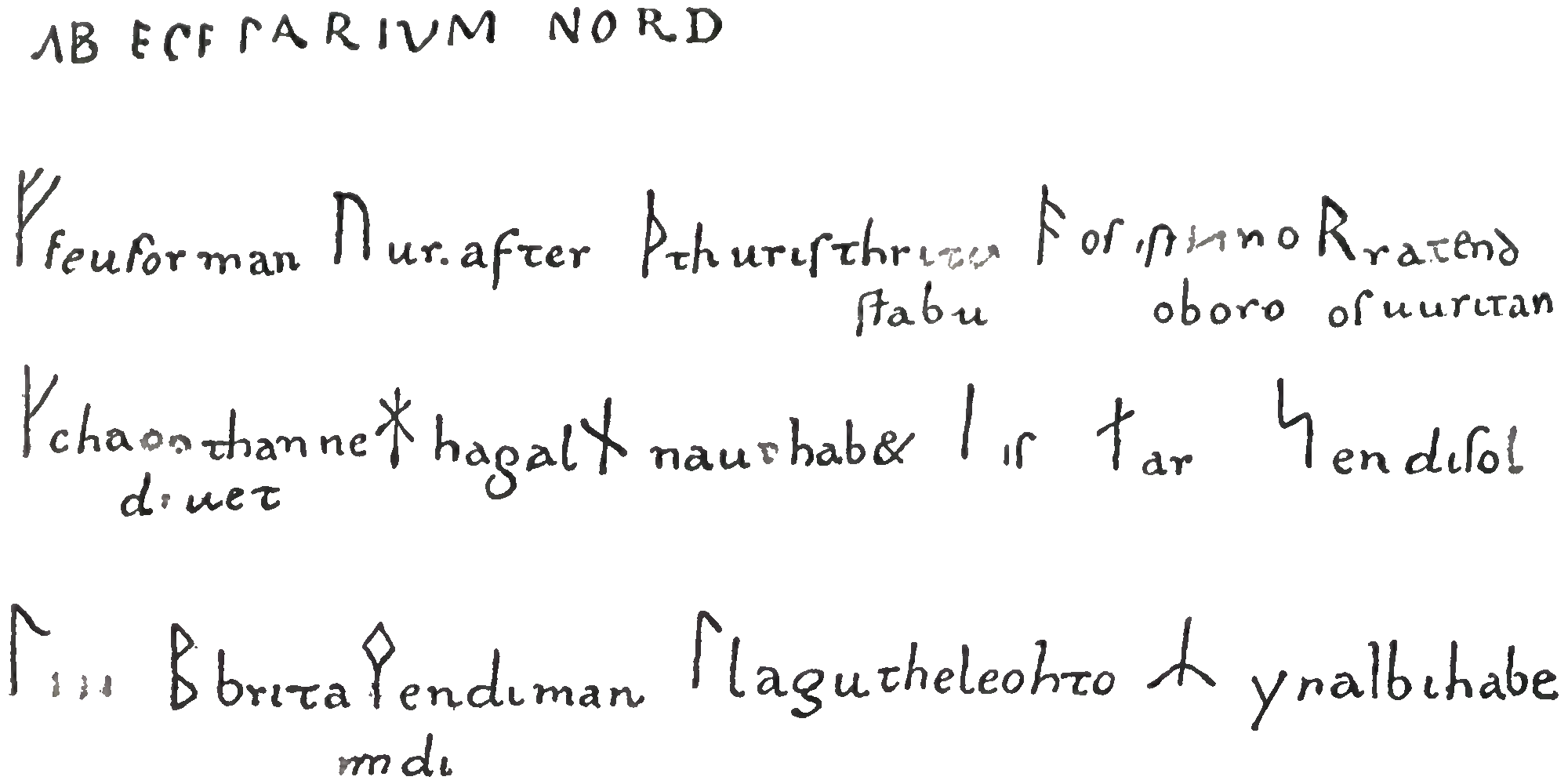
In addition to the heavily stained manuscript page itself, we have two drawings of this section made by Ildefons von Arx and published by Wilhelm Grimm. The first, published in 1821, contains what could be seen by the naked eye before the disastrous treatment; the second, published seven years later, takes into account what could momentarily be glimpsed during the treatment process. The high resolution digital images now available makes it possible to enlarge details and adjust light, colour and contrast dynamically across the various areas and pick out details that von Arx overlooked. In this way, I have produced a tracing of what is visible today, although admittedly I have in places let the earlier readings influence me in ambiguous areas, particularly if the reading in question seemed likely to be correct.
The Anglo-Saxon runes between the lines are clearly secondary, so are presumably the vertical lines separating some runes from the text belonging to the previous rune. In order to facilitate a better understanding of the original composition, I have below reproduced all three drawings both with and without these additions.
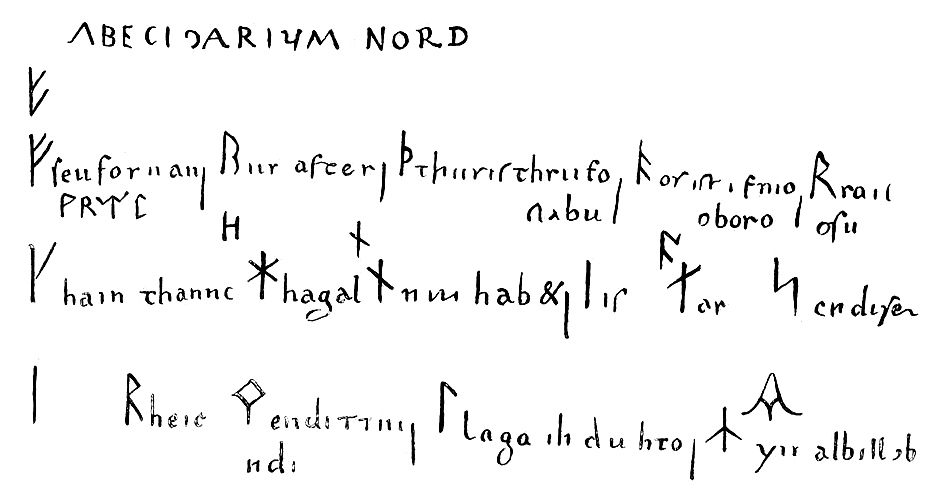
published by W. Grimm in Über deutsche Runen, 1821


published by W. Grimm in Zur Literatur der Runen, 1828
The main content of the section is a long-branch fuþark with early forms of ą and m, and with very little corruption of the shapes beyond the distortion inherent in being written with an angled pen-nib. This is accompanied by the names of the runes interspersed with a few other words so that they form an irregular but alliterating mnemonic, perhaps remotely related to the runic poems. This text was clearly written at the same time as the runes themselves, but the vertical strokes separating some runes from the preceding text seems to have been added later.
Beyond the names, no indication of the sound values of the runes were originally given, just as in the Hebrew and Greek alphabets above. Above six of the runes, however, the corresponding Anglo-Saxon rune is later added, probably by the same scribe. With two exceptions, these are the runes where the younger and the Anglo-Saxon shapes differ, and the addition thus gives the impression of being the work of somebody for whom the Anglo-Saxon runes were as well-known as the Latin letters, and was a natural way to mark the value of the few younger runes that were not immediately obvious to him.
One of these exceptions it that one would expect an Anglo-Saxon o above the younger ą, but this would have been placed in the region known to be rubbed away, and may safely be assumed to once having been present. The other is that n is glossed by the identical Anglo-Saxon rune. Epigraphically, there is no difference in the shapes of f either, but the scribe follows the convention consistently seen in manuscripts of writing the Anglo-Saxon version with a lower branch no longer than the upper. Derolez incorrectly draws the Anglo-Saxon rune in its epigraphical form in his reconstruction. Surprisingly, not only von Arx and Grimm, but also Derolez have entirely overlooked that k is glossed by Anglo-Saxon c; Derolez even comments on the absence of this and o.
The shapes of the runes
Extracted from the surrounding text and aligned vertically based on the baseline of the text following them, the runes look like this:
 |
 |
 |
 |
 |
 |
 |
 |
 |
 |
 |
 |
 |
 |
 |
 |
There is a gap in the lower branch of f, and it is possible that this is the reason why it is not drawn all the way to the top in the 1821 drawing. A similar but much larger gap makes ą appear like a stunted version of its older fuþark counterpart, which is how Derolez reproduces it in his reconstruction illustration. This is clearly incorrect, as the top of the stave is still visible, and the line connecting it to the rest of the rune is included in both nineteenth century drawings. Further, the size of the rune alone would have been enough to strongly suggest that the stave continued beyond the point where it meets the top branch. The next rune with similar losses is t. Here, the 1821 drawing shows only the stave, while the 1828 one includes the right-hand branch, which is also visible in the modern photo. Due to the angle of the pen-nib, the left-hand counterpart would have been very thin, so it is not surprising that it is hard to see, and not included in either drawing. However, one can just make out what looks very much like the terminus of such a line at exactly the expected place in the modern photo. In this photo, the entire lower half of b is missing, but it is included in the old drawings. Both these and the still visible remains show that the upper and lower loops do not meet, but are placed slightly apart on the stave, just like in the Anglo-Saxon fuþark above.
The only real surprise when it comes to the shapes of the runes is m. Like in the Leiden manuscript, it has the rare early lozenge-shaped top, but uniquely, the stave stops at the lower end of this, and does not continue through it to the top. What can be seen today seems to confirm the evidence of the drawings on this point.
The names of the runes
The names of the runes form the core of an alliterative mnemonic
device sometimes termed a poem
due to its parallels to the
Anglo-Saxon runic poem which deserves the appellation, and the
Norwegian, Iclandic and Swedish ones that hardly do so. This poem
is regarded as a linguistic mishmash which beside the rune names
consists of at least both High and Low German word forms. This has
created an assumption that the rune names themselves must be read in
this light, influencing how the damaged ones should be read. As the
clearly readable names generally preserve authentic early Scandinavian
forms, this might be misguided, and I therefore choose to look at the
names in isolation here.
The first entry is clear and well-preserved. It reads
feu
, an early form predating the loss of the thematic vowel. The same form is preserved in Leiden, and must underlie the corruptedfea
of The Book of Oghams.Though somewhat stained, the name
ur
is visible enough to confirm the reading of the drawings. This is also the expected form, as in non-Norse renderings, the length of word-final consonants other than /n/ is rarely marked.Worn, but only moderately stained, the early form
ꞇhurıſ
with retained thematic vowel is still readable. This vowel is lost in Leiden as well as all other recorded forms of this name, underscoring the importance of this source.Clearly readable as
oſ
, and like in all non-Norse renderings of this name, its nasal vowel – covering /ã/, /æ̃/ and /ɔ̃/, with the rune name containing the latter – is rendered as o. For the consonant, see rune 2 above.Towards the end of the line, the text is less well preserved, and only the first two letters
rɑ
are visible. Grimm and von Arx were unable to see any following letter, but Grimm concluded that it had to beꞇ
, which was tentatively added to the drawing. It is not obvious that this is correct, and it would be more prudent to say that the end of the name is lost.The preservation of the beginning of the following line is also quite bad. The reading before the application of reagents was
hɑın
, after it waschɑon
with the last two letters tentative. What can be seen now is compatible with the latter reading, but can hardly be said to confirm it. Given that the name is known from elsewhere to have been /kaun/, both the initial c and the final n fits with the expectations, and o seems more probable than i as the second part of the diphtong. Given the scribe’s evident distaste for digraphs, one must assume a written source for this section, with no guidance as to the original pronunciation, which he certainly would have renderedcɑun
had he known it.In the next name, the letters have flaked off on and below the ruled line, but the remains are consistent with the expected form
hɑgɑl
, without indication of length of the final consonant as in 2.Parallelling the situation in 5, only
nɑ
can be seen of the rendering of /nauð/. Another letter has clearly followed it, and both space and a faint shadow indicates a lost fourth letter. With the application of reagents, the third letter was identified as the expected u, but nothing could be seen of the fourth. Just as in number 5, Grimm assumed that it must have beenꞇ
and tentatively added this to the drawing. This can neither be confirmed nor ruled out by the photo evidence, but if anything the shadow looks more similar toꝺ
.As expected, neither vowel nor consonant length is denoted in
ıſ
which is clearly readable.The exact same situation applies to
ɑr
following it.Towards the end of the line, the preservation deteriorates again, and we must rely on the drawings, where the younger has
ſol
and the older a less clear rendering compatible with this. The photo seems to confirm this reading, but cannot rule out that another letter once followed. This is particularly relevant as Leiden preserves the final u in this name, just like in feu both here and in that manuscript. On the other hand, it is absent in the name list in The Book of Oghams, which as mentioned above must go back to an original with feu.The first name on the third line is entirely lost. It is almost entirely certain that it would have been
ꞇıur
, like in the other sources with early name forms. Besides in Leiden and The Book of Oghams, this form is also found in the first entry of St. John’s College, Oxford, MS 17 whose name forms in general is somewhat younger. Such a form would also match the available space well.The next name is now entirely lost, but was first read as
heıc
and thenbrıꞇɑ
by Grimm and von Arx; neither of which comes particularly close to any expected variant of the name. The resolution seems rather clear to me, though. The unexpected reading of the first letter as h in the first drawing is easily explained by the bottom of the letters having flaked off where they met the ruled baseline, just as in 7. The reading of the next three letters goes fromeıc
torıꞇ
, meaning that a short horizontal stroke had been glimpsed to the upper left of the erstwhile c. By connecting this stroke to the preceding letter instead,ıꞇ
becomesrc
. Reverting to the original reading of the second letter and adding theɑ
seen in the revised one, we end up withbercɑ
, which is only lacking a final n to conform precisely to our expectations. As no part of it can be seen and there would be limited space for it anyway, we are led to postulate that it must have been represented by a nasal bar, yielding a reconstructedbercɑ̄
.Only traces of the following name can now be seen, as was also the case when the first drawing was made. Both sets of traces are compatible with the reading
mɑn
from the second drawing, but cannot conclusively confirm this, even if a final n is the most likely interpretation of the photo evidence. A second n is very unlikely, but in light of the preceding reconstruction, we should not rule out a nasal bar above the existing one, representing a second one to mark a long consonant.The next name reads
lɑgɑ
in the older drawing, butlɑgu
in the younger. The photo is not clear enough to conclusively tell which is right, but leans towards the latter. If read correctly, such a form would side with the Anglo-Saxon form of the name rather than the many variants recorded for the Old Norse name. It is worth noticing that it is the only instance of this if we discount the speculative emendations of Grimm which have no basis in what he was able to actually see on the page.The final name is still readable as
yr
. As the sound value of this rune must still have been ʀ, the secondary addition of the Anglo-Saxon rune of the same name above the entry must have been based on the name of the rune rather than its value, confirming that the scribe copied a written source and did not have a deeper understanding of what it represented.
i@old.no